
Label lust
We love how passionate our butlers are about the small details. Kavita shares with us her lust for labels and an interview she did with David Bowley of Vinteloper. We agree, love the labels!
Vinteloper were actually the labels that inspired me to talk about labels, the graphics and the design of them. Hence, it was only natural that I spoke to David Bowley owner and winemaker or as his business card says – chief everything officer!
I actually saw people with tattoos of his wine label before I had seen the actual wines. I was at an awesome event that brings Pinot Noir lovers together called Pinot Palooza. His table was one of the busiest, but I wasn’t in any rush, the setting was Carriage Works in Sydney, it was a sunny day, there was a DJ playing good tunes and a Mexican food truck – what more can you ask for.
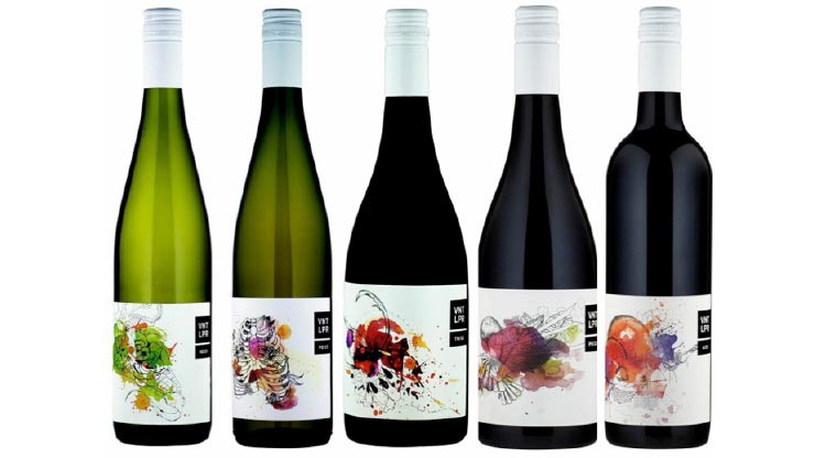
Eventually I made it to the Vinteloper table and was immediately impressed by the labels, it was lust at first sight. Label lust can be dangerous for the heart however, expectations are high and all to frequently some of the best labels are found on the most average wines. A little bit like meeting a handsome guy or a beautiful woman that you have absolutely nothing in common with. It’s pretty awesome however when the wine in the bottle is equally if not better than you had hoped for. The wine leaves a lasting imprint on your memory.
Since then, I have gotten to know David, tasted all the wines and can tell this guy just gets it. From the website and the language used, its not just about being on trend – he’s in it for the long run.
I had a chat with David to find out how his labels came about and why the visual identity of his winery is so important to him.

1). How did you go about your creative process for deciding how you wanted Vinteloper as a brand to look and in turn the labels?
After 4 years of the ‘old’ labels, it occurred to me that the message I communicated to people about VINTELOPER through tastings, social media and some of the unique events I do was not being reflected in the package. I woke up one morning in a cold sweat, rang a friend who is a graphic designer and said “we need to get together – TODAY”.
2). Can you tell us a little bit about the story behind each label?
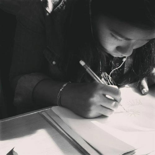
My wife, Sharon, is an extremely talented person who has levels of intelligence, commitment and precision most of us can only dream of. Although she is not a professional artist, she loves to draw. One day, she drew something that contained incredibly fine detail and many layers, much in the same way I hope my wines are. Meshing these elements together was a no-brainer.
3). Who did you work with to design the labels?
Sharon is responsible for the drawings then I work with Chantal at Faux, Non Faux! She is a fantastic and really talented designer in Melbourne.
4). Was it the same people that designed your labels that also did your logo? So cool that people want to tattoo it on themselves!
Kind of… It has been a group effort between Chantal, Sharon and I. We really wanted the logo to be simple, powerful and distinct. Easily recognisable as Vinteloper. The devil is in the detail as they say, which is there in the line drawing and afterwards water colours come in to play.
5). Do you think that the way wine looks/is packaged, affects people’s perception of the actual wine?
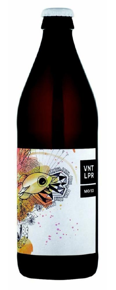
Absolutely! You can sight examples the world over from both old and new. Think of Chianti in the wicker baskets, what perception does that give, similarly labels like Penfolds or Wendouree, they speak of tradition and established quality. At the other end, take my MO/13 Moscato Giallo. Packaged in a 500ml amber beer bottle with a crown seal. It felt like every single person that saw and tasted that wine made a connection to cider, mostly because of the packaging. It is SUPER important, as most of the time it is the only form of communication you have about the wine and what it should be about.
6). Were you trying to attract a specific demographic to your wines when you designed the labels or are they more a reflection of you, and this is what you are trying to express?
There is a target demographic but it is pretty broad. I want to attract people who like interesting things. “Interesting things” can be a lot of things, so it can be easier to tell you what isn’t interesting… Marlborough Sauvignon Blanc is not interesting. A coffee from McCafe is not interesting. Ordering the Muesli when you go out for breakfast is not interesting… I want to attract people that are searching for interesting. That likes fine detail & commitment to a craft. I want to attract people who value FREEDOM. Freedom of expression, artistic freedom, and who value the concept of searching for the best possible experience. I hope the labels express that.
Awesome David. Thanks for sharing with us the creative process behind your beautiful wines and their labels.
Now more importantly, for everyone that wants to actually taste what’s inside the bottle – head over to www.vinteloper.com.au where you can purchase it.
Cheers!
Kx